3 Reasons why colour helps retailers entice and convert more shoppers

Sharon Yourell Lawlor

Sharon Yourell Lawlor

Leading category, consumer and shopper marketing expert

Share on linkedin
LinkedIn
Share on facebook
Facebook
Share on twitter
Twitter
Share on email
Email
Share on whatsapp
WhatsApp
Dolce and Gabana Retail Store Use of Colour to attract shoppers

Last month, as the pandemic lockdown lifted and many retailers opened their doors to shoppers for the first time in 2021, I took the opportunity to do a number of retail safaris in stores around Dublin.  As I walked around many different types of retail outlets, admiring shop windows and freshly painted interior walls, one thing that really struck me was the unusually strong use of colour in different retail environments, even for this time of the year (early summer).  Sensory Marketing is a clever shopper strategy – used by proactive retailers, looking to entice shoppers into their stores and encouraging them to dwell for longer.  Colour is one of the key tools they have at their disposal to positively influence shopper behaviour.  According to a study by the University of Loyola, Maryland, “people make a subconscious judgment about a product within 90 seconds of initial viewing and between 62% and 90% of that assessment is based on colour alone.” – Jill Morton, Why Color Matters, COLORCOM (2005).  So how can colour help you attract more shoppers?

If you have a clear idea of the type of shoppers you are looking to attract, you can use colour to really help appeal to that target audience.  Generally speaking, younger shoppers, for example, will be more attracted to bold colours, while more mature shoppers tend to prefer more subtle colour palettes.  And when it comes to targeting male vs. female audiences, again there are some clear behavioural trends – while both male and female audiences generally like colours such as blue, green purple and red, female audiences have a tendency towards lighter hues and tones of these colours while male audiences prefer bolder variations.  blog.vmgstudios.com/brand-color-psychology-men-vs.-women

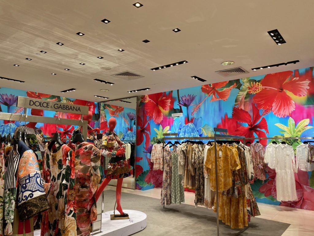
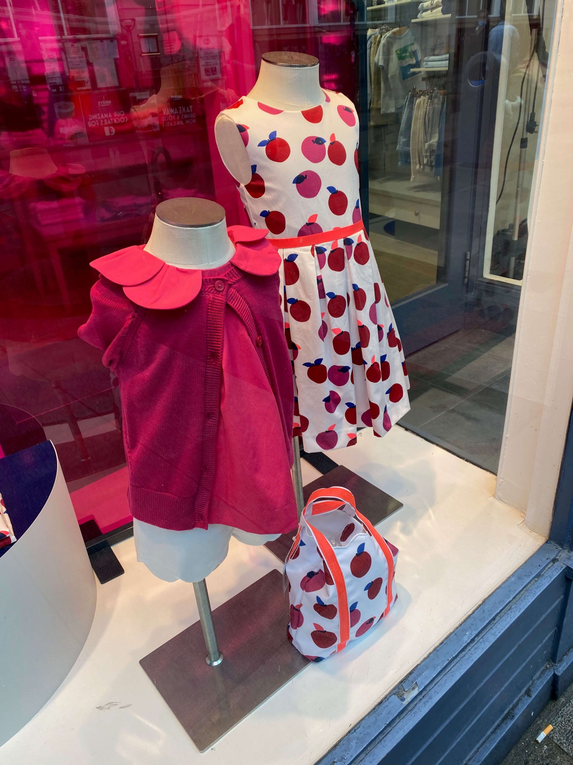
If you have ever walked into a store and instantly felt more at ease and therefore willing to dwell longer in the outlet because of the beautiful surroundings, the mood and the atmosphere, the chances are that this has been carefully thought out to appeal to your senses, with the use of colour as a strong component.  Retailers use colour as a means of stirring emotional responses from shoppers.  Think colourful Christmas decorations encouraging early festive shopping or pink hearts to drive purchase for a loved one on Valentine’s day. 

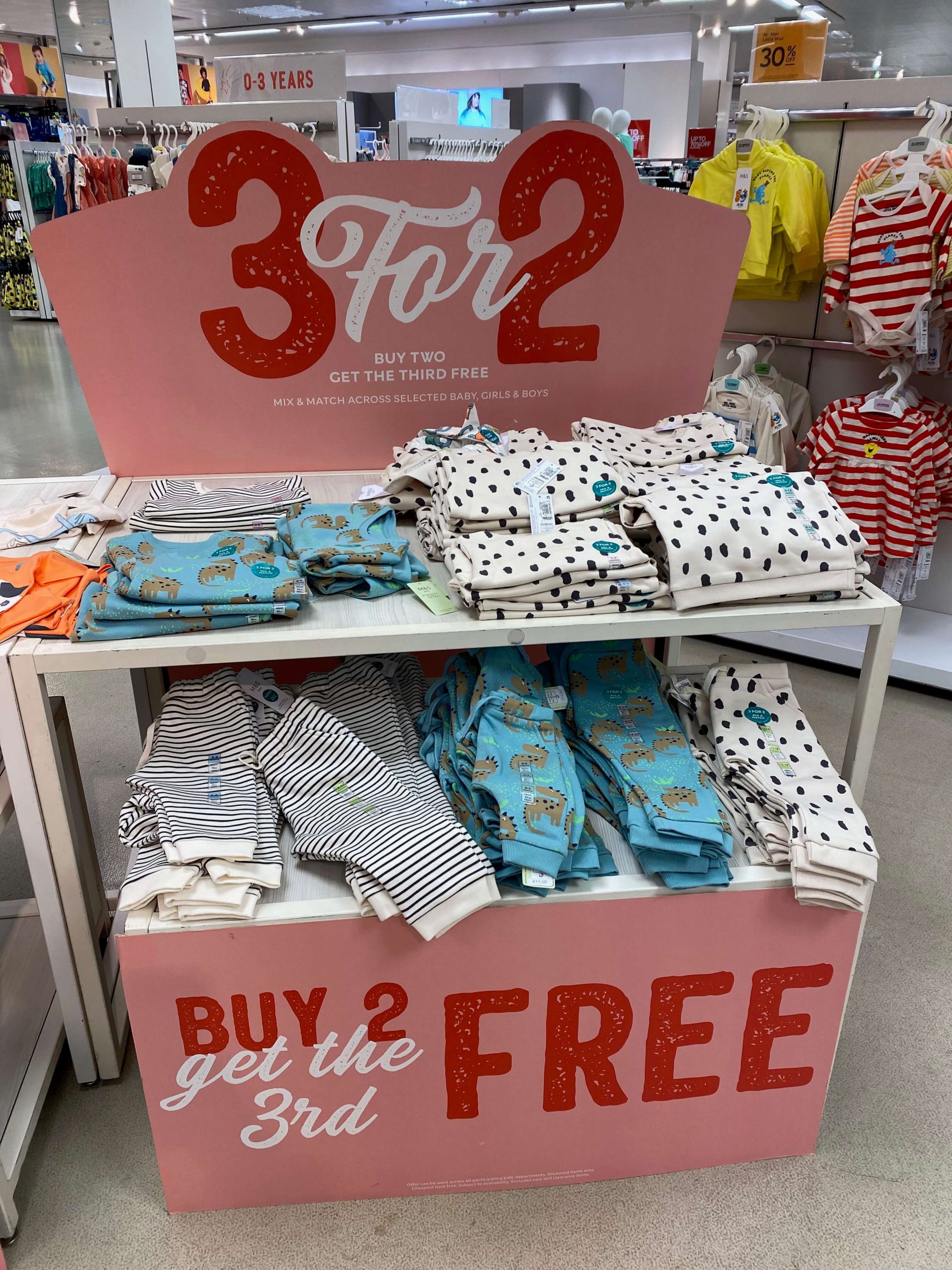
Retailers will often use red as a means of encouraging ‘urgency’ for purchases on discounted items.  However, as an overall environmental colour used within the store, red interiors can create tension.  Blue, on the other hand, is known to have a more calming influence on shoppers.  Creating the right environment is crucial for retailers as the more you can encourage shoppers to ‘dwell’ within the physical store environment, the more they are likely to buy.  Now that restrictions have been lifted, retailers are looking to boost shoppers’ moods with bright summer messaging and positive word cues.

Colour can be very effective in helping you define your key proposition to target audiences.  According to StoreBest’s report on ‘The Psychology of Retail Store Interior Design’, lots of electronic retail technology stores will keep to simple strong colours such as blacks and greys as they give an impression of strength and confidence.  Colour will often be used to invoke a sense of urgency, with bold colours such as reds used to denote keen offers in store.  If you can use colour to help strengthen your key product proposition in the shopper’s mind, it will attract more shoppers.  The fish shop signage  example below is very impactful in blue, driving natural associations between the store and its key product range – fish.  The impact would not be the same if this wall was in yellow or green.  Look at your product, service or retail proposition and make sure that your colour choices around the store are aligned with it.